Website Audit · August 2026

Joyride Charters,
seen all the way through.

Everything I found, what I already fixed along the way, and exactly what to do next. Measured figures are sourced; estimates and my own judgments are labelled as such.

Prepared for Joy Sherman by Dez Darville

$4,000 to $5,000
One open Croatia cabin
Your own pricing. Croatia has open cabins now, so this audit is ordered around filling them.
302 shown, 3 came in
International page, 4 weeks
Google showed your international booking page 302 times. Fewer than one in a hundred clicked.
0 of 4 answered
Form tests, by hand
All four test inquiries arrived safely in your records. No guest received any reply.
3 fixes live
Done during the audit
Broken links repaired and five sold out trip pages removed, verified on your live site.
Scroll
1

Overview

The short version

Your Connecticut business is healthy and climbing. The softness sits on the international side. Google showed your international booking page 302 times in four weeks and about three of those appearances turned into a click, so guests are seeing it and passing by. Connecticut took 42 inquiries in sixty days and is rising. International took 10 in the same period, and that is the side where, in your own words, the revenue is.

The audit traced why. The guests most likely to book were being routed in circles. Your Instagram bio funnels through one link page, and its INTERNATIONAL SAILING button sent people back to your homepage instead of your trips, while your Facebook page's only link skips the link page and drops guests on the homepage. Five sold out 2024 and 2025 trip pages were still live and still being found in Google. An email signup popup opens on top of your inquiry form and covers the submit button on a phone. And underneath all of it, a guest who fills in either form gets no automatic acknowledgement of any kind.

Fixed during the audit, live on your site now

The INTERNATIONAL SAILING button on your link page, the page behind your Instagram bio, now takes guests to your By the Cabin trips instead of back to your homepage

Live

A dead link inside your Privacy Policy, where the words "clicking here" went nowhere when clicked, now works

Live

Five old trip pages from 2024 and 2025, all sold out trips, deleted, so the stale content is gone; until forwarding is live, an old link shows a page-not-found

Live

Forwarding set up for those five deleted pages, explained just below

Waiting on Wix
The forwarding, in plain terms

Those five deleted trip pages still show up in Google, and people still click them. Forwarding means anyone who clicks one of those old links gets carried automatically to the right current page, your Greece or Croatia trips, instead of hitting a dead end. I set this up inside your Wix account and confirmed it is saved correctly, but the forwarding tool is not writing the rules to your live site and the cause is unresolved on Wix's side. It needs a support ticket with Wix, which I have drafted and ready, and because it goes in from your account I want to run it by you before I file it. I did not stop there. I dug into the platform and found a second route around their tool, using the developer layer your site already has. The method checks out against Wix's own documentation; it has not yet been built or tested on your site. Building and live-testing it is a small piece of work, and it is the first thing I would do in the implementation phase, so your old links forward properly whether Wix fixes their tool or not. Until then, those old links show a standard "page not found," which is already better than showing a sold out 2025 trip.

One reversal worth explaining

The SAIL THE WORLD button on your homepage was on my fix list, and I briefly pointed it at By the Cabin. On a closer look I put it back the way you had it. Your homepage already is your international page, and the BY THE CABIN button sits directly beside SAIL THE WORLD, so my change only duplicated its neighbour. That button was never broken. It is redundant, which is a layout question, and rather than leave you hanging, my recommended direction is laid out in the trip template section below.

2

Priorities

The three things that matter most

In the order I would fix them, and what each one is costing while it waits.

1A guest who inquires gets no automatic reply

The problemI filled in and submitted your forms four times, on a computer and on an iPhone, using three different email addresses, exactly as a guest would. Every one arrived safely in your records, and not one produced any reply to the guest, not even a receipt. Meanwhile the text directly above both forms promises that Joy will get back to you within 2 hours or sooner.

What it costs youThat promise rests entirely on you personally seeing the notification. On a charter day, a guest who inquires at ten in the morning has no signal anything happened until you are back on land. The guests most likely to fill in a form and keep shopping other companies are exactly the international travelers you most want.

In your numbers: one Croatia cabin is worth $4,000 to $5,000 in gross revenue, your stated pricing. If silence costs you even one cabin booking a season, this single gap outweighs every other item in this audit.

The fixAn instant automatic reply on both forms, built with tools already inside the Wix account you pay for today, with no new software and no added monthly cost. It confirms what the guest asked about, tells them when to expect you, and gives them your phone number in the meantime.

What changesYour 2 hour promise stops depending on your attention. Every guest gets an answer within seconds, even when you are on the water.

"Thanks for submitting!"Then nothing arrives. No receipt, no reply, nothing until you are back on land.
Today, after submitting
becomes
A reply, seconds laterConfirms the trip they asked about, sets the 2 hour expectation, and gives them your phone number.
New, every inquiry, any hour

2Your highest intent guests were being sent in circles

The problemInstagram offers guests exactly one link, and it points at a little four button page. Until this week, the button on that page marked INTERNATIONAL SAILING sent people back to your homepage. A guest who saw your Croatia post, tapped your only link, and pressed the button that said international, started over at the top of your site. Facebook offers exactly one link too, and it skips the button page entirely and drops guests on the homepage, so neither channel was landing your most interested visitors anywhere near a trip.

What it costs youOver four weeks Google showed your international booking page 302 times and about three of those appearances became a click. Both of your busiest social channels were pouring your most interested visitors back onto your homepage, while Croatia sits with open cabins at $4,000 to $5,000 each.

The fixAlready done and live. That button now goes straight to your By the Cabin trips. The bigger version of this fix is collapsing the whole path so every trip page carries its own inquiry button, instead of sending guests through a page that asks them to choose again.

What changesThe distance between seeing a trip and asking about it drops from three clicks to one.

Croatia post›Only link in bio›INTERNATIONAL
SAILING
›Homepagestart over
Until this week
now
By the Cabin trips
One press, straight to your trips

3Your homepage takes 27 seconds to show its main content on a phone

The problemI measured every key page the standard way Google does, on a simulated mobile connection, five separate runs each, keeping the middle result so no lucky or unlucky run skews it. Your homepage takes 27 seconds for its main content to appear and weighs 17.3 megabytes. For scale, the target I hold pages to is 2 to 3 megabytes. The single largest item is your background video. The file on your account is 42.3 megabytes, and even the smaller version Wix serves visitors is about 7.5 megabytes, downloaded on every single visit.

What it costs youGuests on a phone at a marina, on hotel wifi, or on any slower connection wait the longest, and they are the likeliest to give up. A slow site is also the most common reason a website feels unprofessional to someone who cannot say why.

The fixThe fix is not to remove the moving water, which is part of the look you own and I promised to keep. I would replace the source file with a short, properly compressed loop a fraction of the size, with a still photo that appears instantly while it loads. Then deal with the Instagram feed, which pulls 3 more megabytes from Instagram's servers on every visit, and compress the oversized photos.

What changesSame feel, a fraction of the weight. The realistic target is moving your speed scores from the low 50s into the 70s, and I would show you the before and after side by side.

Your homepage, main content on a phone27.1 seconds
A healthy pageabout 3 seconds
3

The walk through

The guest journey

I walked your website the way a real guest does, starting from Facebook, Instagram, and Google, all the way through to submitting your forms on a computer and on an iPhone.

Where guests come in

Instagram, 1,559 followers, sends everyone to one four button link page, and the button fix I made there is live and verified. Facebook, 1,300 followers with 96 percent recommending you across 25 reviews, offers exactly one link, and as of this weekend that link goes straight to the homepage rather than the button page, so Facebook guests skip the buttons entirely and land on the general front door. One thing worth knowing. Those 25 glowing reviews sit buried in a tab most guests will never open.

Google is more awkward. On a bare "Joyride Charters" search, who shows up first depends on where the searcher is standing. From Connecticut your listing leads the map results, while a searcher farther away can be shown a Florida business with the same name first, because Google's map results favor whatever is nearby. Your listing itself is healthy, 4.7 stars from 15 reviews with a working website button, but the Florida namesake carries 50 reviews to your 15, and review count is the one lever here that is fully in your hands. Your listing on Bing, the other major search engine, shows a perfect 5 stars from 16 reviews but lists a different street address than Google does, which is why I asked you which address is correct.

The click math

From any trip page, a guest reaching an actual inquiry form takes 2 to 3 clicks. Trip page, then the Choose Your Sail page that asks them to pick a side, then finally the form. Guests coming from social media add another step before that. Every extra step loses a share of people, and nobody planning a $4,000 trip should have to solve a maze first.

Your forms, tested by hand

Both forms work correctly. Every submission I made arrived intact in your records, on computer and on iPhone. Two pieces of friction sit around them. On the Connecticut form, one instruction asks the guest to reason about a completely different product mid form, worth rewording. And both forms end with a "confirm you are human" security check, which is legitimate protection but one more hurdle for older guests.

Then there is the popup. An email newsletter signup window opens on top of your pages, and it is not only a phone problem, it appears on desktop too. On the iPhone it opened directly over the inquiry form and covered the SUBMIT button. It does have a clear X and closes easily, so it is friction rather than a wall, and it is exactly the mobile form problem you described to me. The form was never broken. The popup lands on top of it, at the precise moment a guest is already typing their email address into your inquiry form, which makes a second email request confusing. The fix is a settings change, not a rebuild: stop it appearing on the two inquiry pages, and show it once per visitor instead of every visit.

Name
Email
Which trip?
SUBMIT
✕"Don't miss the latest Joyrid…"
the signup popup, opening on top of the submit button
Your inquiry form on an iPhone, as I found it

One quiet discovery from the testing, included for honesty: when a submission looks robotic enough to trip Wix's spam filter, it is discarded silently while the guest still sees the thank you message. It took three deliberately artificial test entries to trigger this, so a real guest will rarely hit it, but when it happens nobody is told and there is nowhere to look for what was lost. It is a limitation of the form system worth knowing about, and one more reason the instant reply matters: a guest who gets no email knows to call.

The numbers underneath

FormJuneJuly, to the 27th60 day total
Connecticut inquiry152742
International inquiry6310
Waiver819
Registration9211

The sixty day window opens in late May, so the international total includes one inquiry from the last days of May that sits before the June column.

Connecticut nearly doubled month over month. International runs at roughly a quarter of Connecticut's volume and declined inside the window, while Google was showing your international page 302 times with almost nobody clicking. So the softness you felt is real, it sits on the international side, and it sat there while the path into that form had a button sending guests in circles and a popup covering the submit button. That is why I treat these fixes as revenue work, not housekeeping.

One more thing this table shows, and it may be the most valuable sentence in this report. Sixty days produced 42 Connecticut inquiries but only 9 waivers and 11 registrations, and since a guest who books completes both a waiver and a registration, that paperwork points to roughly ten bookings. I want to be precise about what that does and does not prove. Your records do not connect an inquiry to the booking it became, so the true conversion rate is unknown, and building that baseline is part of the implementation work. What the audit did establish is that no automatic follow-up exists on either form, so once a first conversation stalled, nothing on the site sent a second touch. Your own manual follow-up by phone or email was outside what I could measure. The instant reply in the findings above is the floor. A simple follow up note to inquiries that go quiet is the ceiling, and against cabins worth $4,000 to $5,000 it would outearn every speed fix in this report.

4

Performance

Speed, measured honestly

Every number below is the middle result of five separate test runs per page, using Google's standard mobile test. A guest on strong wifi sees better than this. A guest on cellular at a marina sees worse.

PageScore out of 100Main content appears inPage weight
Homepage5227.1 seconds17.3 megabytes
Connecticut Sailing5425.2 seconds10.1 megabytes
By the Cabin387.5 seconds10.3 megabytes
Croatia3713.9 seconds10.3 megabytes
Contact553.1 seconds10.1 megabytes

For scale, my targets: a score of 70 or better, and a mobile page of 2 to 3 megabytes. Yours carry 10 to 17. These are simulated lab results, not live-visitor timings, run the same way every time.

Your homepage17.3 megabytes
A good mobile page2 to 3 megabytes

Three causes are fixable and one is not. The background video is the largest single item, covered above. The Instagram feed embedded on your homepage pulls 3 or more megabytes from Instagram's servers on every visit, and can be replaced with a static grid of your best photos or set to load only when a guest scrolls down to it. And several photos on the site are 8 to 12 megabyte originals that can be compressed with no visible difference. What cannot be fixed is roughly 1 megabyte of Wix's own platform code, which every Wix site carries. I tell you that so the target stays honest: the aim is the 70s, not a perfect score.

Housekeeping note: your media library also holds several large raw video uploads, one of 321 megabytes, that do not appear on any page. They do not slow the site down, but they eat the storage space your plan pays for.

6

Findability

Found on Google, hidden at home

This section was added on August 9, a week after the audit was delivered, because of something you experienced yourself that Sunday morning. It turned out to be the clearest evidence in this whole report, so it earned its own chapter.

What happened on Sunday

You wrote to me because your Greece May 2027 trip seemed to have vanished from the website. Nothing was missing. The page was live, the homepage card was live, and nothing in the site's history showed a removal. What actually happened is more useful than a bug: the layout of your own website made a trip easy to miss for you, the person who knows it best. A first-time guest has less to go on than you do.

Why it hid

Your October 2026 Greece trip and your May 2027 Greece trip wear the exact same title, "Sail the Greek Islands," over nearly the same photo. The October card now carries a FULL banner. A scrolling eye catches one Greek card, reads FULL, and moves on, and that morning the May 2027 card sat directly below its twin, where it never registered. On a computer it was harder still: May 2027 was the last card in the section, below the British Virgin Islands.
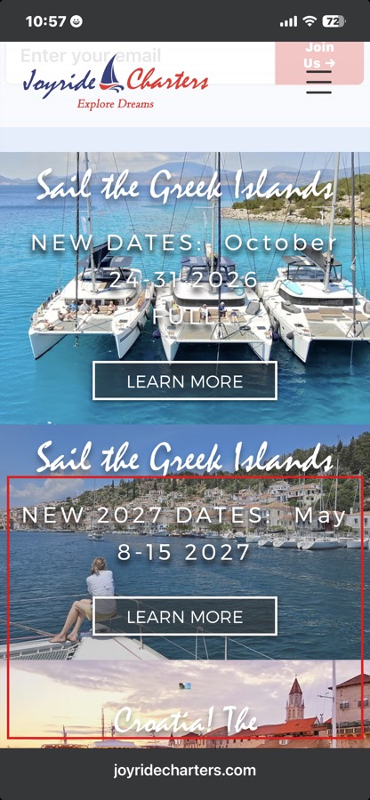
Phone screenshot: the October Greece card marked FULL, with the May 2027 card boxed in red directly below it
Your homepage on a phone that Sunday morning. October up top, May 2027 in the red box.

There is a reason they look like twins. The May 2027 page was created as a duplicate of the 2026 page, the site's own history still shows its original "copy of Greece 2026" address, and the homepage card arrived the same way. Duplicating a page is the fastest way to make a new trip, and it silently guarantees the new trip looks identical to the old one.

How that Sunday ended

By early afternoon you had gone into the editor and sorted it yourself: the trips now run in date order, October through May. That instinct was right, guests understand a calendar. It also revealed one more layer worth naming. In Wix, what the editor shows you on its phone preview and what a visitor's phone actually displays can differ, an element can sit hidden on mobile while looking fine on desktop, which is a plausible reason the trip seemed missing to you while it was live for visitors; I could not capture the editor state you saw that morning, so I am reporting what you described alongside what I verified live. That quirk is not your fault, and it is exactly the kind of thing that should not have to be your problem.

Date order does carry one cost. Your soonest trips are the least bookable, October is full and Croatia is weeks away, while the trip that most needs deposits, Greece in May, now sits at the end of the list on every screen. The order can stay. What the cards need is status doing the selling: a FULL banner already tells guests to move on, so an equally clear CABINS OPEN mark on the 2027 trips, and one line above the section pointing to what is currently booking, lets a guest see in one glance where they can actually go.

The bigger pattern

On a computer, the SAILING menu at the top of your site did not list your international trips when I checked, and I found no version of the site this year that did. A desktop guest reaches your trips only by scrolling the homepage, the same scroll where Greece was easy to miss, and the INTERNATIONAL CHARTERS entry in that menu leads back to the homepage rather than to any trip. Your trips are your highest-value pages, at $4,000 to $5,000 a cabin, and there is no reliable road to them.

A guest who thinks Greece is full books nothing, and tells you nothing. You only learned this was happening because the owner happened to be the guest. The fixes are direct: every trip listed by name in the SAILING menu, the two Greece cards made unmistakably different with their own photos and clear season labels, your date order kept, and open cabins marked as loudly as full ones.

7

The work

The full action list

Everything found, sorted by who should do it. Some of these are genuinely yours and take five minutes. The rest is the work I would take off your plate.

Yours, quick, and free

Fix the "Worldwinde" typo1 min

It sits in your Facebook page bio.

A ten second polish on your busiest channel.
Update LinkedIn to 22 years1 min

Your company page still says "14th year." The real number is better.

Heritage is a trust signal. Claim all of it.
Confirm your street address1 answer

Google and Facebook say 63 Pilots Point Dr. Bing says 5 Leeway Dr. Tell me which is right and I align Bing with Google.

One consistent address everywhere guests look.
Reclaim your Google Search Console1 email, or I handle it

This is the tool where Google reports how people find you: the exact searches, the clicks, and any problems Google finds with your site. Right now you cannot see its owners from your login, which usually means it is verified under an outside account, most likely a previous designer. Until we confirm who owns it, your search history may be sitting in someone else's hands with Google's warnings going to them, not you.

Two ways to fix it: email them and ask to be added as owner, or skip them entirely and I verify ownership fresh through your own domain and, once ownership is confirmed, remove any stale account for you.

Your search data belongs to you.
One word on the second Instagram handle1 answer

The handle I spotted in July, @joyridechartersbda, has since disappeared from Instagram, so I only need to confirm that was your doing.

Closes the last open question from the sweep.

Mine

Instant automatic reply on both inquiry forms

Today a guest who inquires gets no acknowledgement until you personally answer, even though your site promises a reply within 2 hours. A traveler comparing three operators usually books with whoever responds first, so the instant reply keeps you first in line every time, at any hour, on any day.

At 4 to 5 thousand dollars a cabin, one extra booking pays for this many times over.

The highest value item in this audit.
Take the signup popup off your inquiry pages

Stop it opening on the two inquiry pages, and show it once per visitor instead of every visit.

Removes the friction sitting on your money pages.
Replace the background video file

A compressed loop a fraction of the size, plus a still image that appears instantly while it loads. The moving water stays.

The single biggest speed win, and it keeps the look.
Lighten everything else

Replace or defer the Instagram feed, and compress the oversized photos site wide.

The rest of the speed picture.
Write your details in the format machines trust

Your business details written into the pages in the structured format Google and AI systems read: who you are, where you are, what you offer.

You currently have almost none of this.
Name the eight LEARN MORE buttons

Eight identical buttons, renamed so each says which trip it opens.

Guests and Google both stop guessing.
List every trip by name in the SAILING menu

On a computer, the menu at the top of your site does not list your international trips, and its INTERNATIONAL CHARTERS entry circles back to the homepage. Every trip gets its own named entry, so a guest anywhere on the site is one click from any trip.

Your highest value pages finally get a road to them.
Make the two Greece trips unmistakable

Its own photo for May 2027, a clear season label on each card, and the open trip placed above the full one. This is the fix for the card that hid from you on Sunday.

A guest who thinks Greece is full books nothing.
Give the homepage one job

Right now it tries to speak to two different guests at once, the Connecticut day sailor and the international traveler, and neither gets a clear path. The homepage becomes a simple front door with one obvious door for each journey, and By the Cabin becomes the page every international guest lands on, the way the trip template section lays out.

Settles the SAIL THE WORLD question for good.
Tidy the page headings

Each page declares one clear subject instead of three.

Helps every search and AI system read you.
Describe the six unlabeled photos

Of 76 photos on the homepage, 6 are missing descriptions: the overhead shot of your sailboat on the water, the three catamarans rafted together in a blue Greek bay, the sunset harbor in Croatia, the small pink Meetup logo, and two images inside the Instagram feed widget, which fix themselves when that widget is replaced.

You are already at 92 percent. Finish the job.
Put your reviews on your own website

4.7 stars on Google, 5 on Bing, 96 percent recommend on Facebook, currently visible everywhere except your site.

Your best trust asset, currently invisible.
Show Connecticut pricing on the page

A real number, visible without a phone call.

Guests stop phoning you to ask.
Carefully resolve the translation app

Your site carries a Wix add-on built to translate pages into other languages. It was never finished being set up: English is its only language and nothing was ever translated, so it does nothing for guests, but it sits wired into the same machinery that controls the link forwarding.

The likely reason the forwarding will not switch on, and removing it wrongly would destroy work, so it gets handled with care.
Straighten the old forwarding chains

Web addresses from past seasons still float around the internet, in old emails, old posts, and Google's memory, and forwarding is what carries a guest who clicks one to the right current page. Some of yours forward in a chain: one old Abaco link hops through four retired pages before it finally lands. Every hop slows the guest, and Google trusts the final page a little less with each jump. The fix points each old address straight at its destination in one hop.

Waiting on the same Wix fix.
Repair the last loose links

Two broken blog links, and the contact page button that links to itself.

Loose ends from the link sweep.
Connect your site to Bing's webmaster tools

The Bing equivalent of Search Console, currently not set up.

Bing feeds ChatGPT and Copilot. Part of the AI answer.

One thing I would refer out rather than do: filming new footage, if you ever want a fresh hero video. Compressing the beautiful footage you already have needs no filming at all.

8

The field

How you compare

Six real by the cabin operators, scored 1 to 10 on the things that decide whether a guest books. These are my judgments applied to evidence I captured from each of their websites in July 2026.

What guests look forJoyrideDream YachtMooringsFestivaSeafarerAdventure­Women
Prices visible before asking389978
Ease of booking466969
Trust proof on their site2677108
Trip page clarity578869
Fit for solo travelers 50 plus6454510
Destination pages structure498767
Average4.06.77.27.36.78.5

What the strong ones do: The Moorings shows single and double cabin prices side by side. Festiva has a live calendar and near instant booking. Seafarer leads with 622 verified reviews and accreditation badges right on the homepage, and even they leak, their solo travelers page currently returns an error. AdventureWomen is the closest match to your audience: a named testimonial from a widow, roommate matching so solo travelers pay no single supplement, a live "only 4 spots left" counter, and full self serve booking.

One of those is worth copying as an offer rather than as a website feature. Roommate matching, where a solo traveler shares a cabin instead of paying for both beds, is the strongest lever there is for the solo women who are your best audience. You already do this informally. Two of your own recent international inquiries asked for exactly it in their messages. Saying it plainly on your trip pages, in those words, costs nothing to build.

One of them wrote that she would share a room with another female traveler.From your own recent international inquiries

Here is what none of them can say. A woman captain, USCG Master since 2004, who hosts every trip herself, with a sold out track record. Dream Yacht and The Moorings sell fleets. You sell Joy.

Since 2004 USCG Master Captain Woman owned Hosts every trip herself

Nothing in this table asks you to become them. Your lowest score, trust at 2, is also the most fixable number on the board, because the proof already exists. It just is not on your website yet.

9

The template

Your trip page template

The answer to the template you asked for. Every trip page carries the same nine blocks in the same order, and eventually you publish a new trip by filling in a form instead of building a page.

joyridecharters.com/croatia-2026
  1. Title. Destination, dates, one line of hook.
  2. Cabins remaining. "4 of 8 cabins left" is the strongest booking trigger anywhere in the competitor set. And this can run itself: you set the total cabins once when a trip opens, and each time a guest registers the counter ticks down on its own. You can always override the number by hand, but you never have to remember it.
  3. Price. Per person, double occupancy, with the single cabin option stated plainly. A real number, visible without emailing you.
  4. What is included, and what is not. Two short lists.
  5. The itinerary, day by day, brief.
  6. Hosted by Joy. Your photo, USCG Master since 2004, one line of your story. The block none of your competitors can copy.
  7. Proof. One or two named guest quotes, ideally from the same destination.
  8. Inquire. A button straight to the form with the trip already selected, and nothing in between.
  9. Practicalities. Flights, insurance, deposit and cancellation, linked rather than pasted in.

Today every trip page on your site is built by hand, and behind the scenes there is no organized trip data at all. The implementation work builds you a simple trip catalog, destination, dates, price, cabins left, itinerary, photos, plus one master page design wired to it. After that, launching a new trip means typing its details into your dashboard, and updating "cabins left" is a thirty second edit from your phone on the dock. That is the piece that makes all of this sustainable without me.

Your website also splits naturally into two lanes, Connecticut day sails and international trips, and every guest should be sorted into their lane within one click. The Connecticut lane already works, 42 inquiries in sixty days and climbing. Protect it, and answer its one known complaint by putting prices on the page. The international lane is where the blueprint above earns its keep.

And the homepage question, answered

The SAIL THE WORLD reversal earlier in this report deserves a real answer, not a shrug. The confusion exists because your homepage is doing two jobs at once: the front door for everyone, and the landing page for international charters. My recommended direction is to let By the Cabin become the true international landing page, point the menu's INTERNATIONAL CHARTERS entry there, and give the homepage one job, greeting every guest and sorting them into their lane within one click. The five card strip in the middle of your homepage already wants to be that sorter. Once that is true, SAIL THE WORLD either points somewhere meaningful or retires, and no button duplicates its neighbour. Because that change touches design, menus and copy together it belongs in the implementation work, but the destination is decided, and I would bring you two or three mocked up options to choose between rather than asking you to imagine it.

10

The road ahead

The next ninety days

Ordered by money at stake, not by size of task. Croatia has open cabins now, so everything touching the international path comes first.

1Stop the leaks
First 30 days
  1. The link forwarding goes live, carrying every old trip link to the right current page. The full story sits in plain terms at the top of this report.
  2. The instant reply goes live on both forms, answered within seconds.
  3. The popup stops covering your inquiry forms.
  4. The remaining small link repairs.
  5. Your own five minute items from the action list.
2Fast and trustworthy
Days 30 to 60
  1. Background video replaced with the compressed loop and instant still image.
  2. Instagram feed replaced or deferred, and the site wide photo compression pass.
  3. Your reviews put on your homepage and both booking pages.
  4. Connecticut prices published.
  5. Speed retested the same five run way, and shown to you before and after.
3Build the machine
Days 60 to 90
  1. The trip catalog and master trip page, with your current trips moved in.
  2. Titles and descriptions rewritten for the pages Google already shows, starting with the international page and its 302 impressions.
  3. The two lane cleanup, retiring the Choose Your Sail fork.
  4. A monthly one page scorecard you can read in two minutes: inquiries, top pages, search clicks, speed.

What to watch in the first month: international inquiries per week, against the current baseline of 10 in sixty days versus Connecticut's 42. The signal these fixes are working is that gap narrowing while Croatia still has cabins to sell.

What to watch by day 90: people finding you by searching for what you sell rather than your name, and how long it takes you to launch a trip page yourself. The target is under an hour, on your own.

Deliberately not included, and what I left for the next step

Audience messaging, a content to booking map, and an analytics tracking plan, each deferred at your request. The Croatia email campaign, which I can quote separately while those cabins are open. And video production, which I would refer out. A few pages also sat outside this audit's tested path: your deposit page, the guest portal, the call scheduling page, and a travel protection form I found late in your records with 14 submissions. A review of the payment and paperwork flow is the first thing I would put on the implementation list.

Two more assets surfaced while I worked, and they belong on that same list. Your waiver and registration records hold several hundred paperwork entries with email addresses (unique, consented contacts still to be counted), people who already paid, already sailed, and already trust you, which is the warmest possible audience for open Croatia cabins. And the same automation tool that will send your instant reply can also ask happy guests for a Google review a few days after their sail, which is how 15 reviews in 22 years becomes a number that matches how good the trips actually are. Everything in this pack is yours to keep, and it works whether the person implementing it is me or anyone else.

The goal: a site as welcoming as stepping aboard with Joy.

Key findings tested and sourced. Every fix gets a written scope before you approve it. The next move is yours.